Content that’s easy-to-understand, decisions driven by data, and communications that effectively capture attention has never been more critical as the world collectively searches for simple answers to big questions and new opportunities to replace old plans. As digital-marketing technologists, we know how important digital content is, so we’ve gathered and examined key pieces of digital content that communicates responses and resources for navigating the COVID-19 situation from governments, international organizations, and independent contributors. Here’s our examination of different content distribution efforts to gain inspiration for your future content campaigns, and for staying safe and healthy, too!
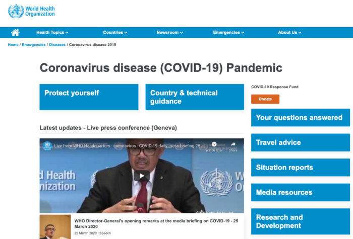
Multiple times daily, the World Health Organization (WHO) provides updates and posts them directly to a landing page for quick and easy access. The page keeps the most important information above the fold so that the reader doesn’t have to scroll down to find what they need.
The page provides the reader with critical information quickly: how to protect yourself, specific guidelines for each country, travel bands and resources for media, the next essential distributor of their information.
A clearly-marked c “Donate” button is featured in orange, a colour that represents enthusiasm and extroversion in marketing. This call-to-action quickly attracts anyone who wants to contribute to a cause, in this case the WHO’s emergency-response fund, to get involved easily and quickly.
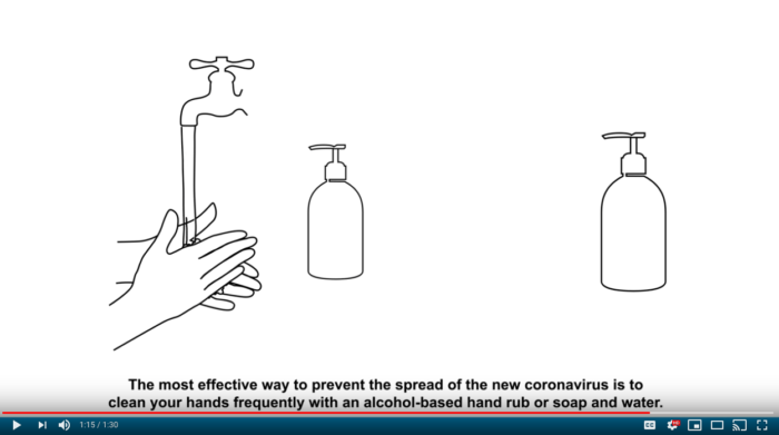
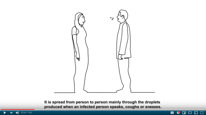
Hand-drawn video illustrations explain critical information for curious and concerned citizens. These videos describe how people can protect themselves by outlining some essential steps we can take to protect ourselves. All videos have captions to ensure people both listen and read the information.
Video Content for Complicated Communications

Kurzgesagt is a YouTube channel based in Germany that exists to explain advanced scientific concepts in a nutshell with engaging animations and straightforward narration.
Their production of The Coronavirus Explained & What You Should Do video answers complicated, stressful questions for viewers with easy-to-follow language and visually-pleasing animations. Animations are easy to follow and use friend bird-like characters to showcase our human behaviour, while the virus is depicted as an evil monster, which it really is. The script is straight to the point and answers many common questions surrounding the virus.
This video presents critical information in a compelling and visually pleasing way. Animations are easy to follow and use friend bird-like characters to showcase our human behaviour, while the virus is depicted as an evil monster, which it really is. The script is straight to the point and answers many common questions surrounding the virus.

All Kurzgesagt videos are accompanied by their sources and provide further reading material from Google Sources. They are often produced in partnerships with recognized institutions like The Bill & Melinda Foundation, which increases credibility and distribution channel networks.
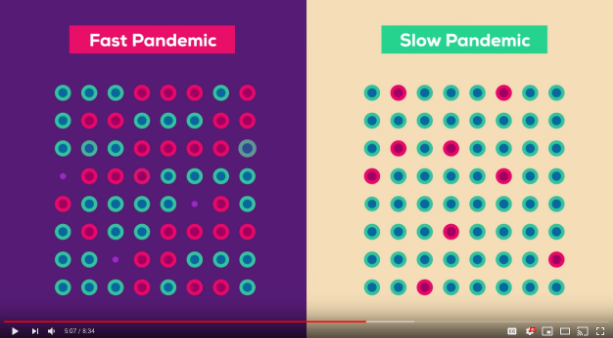
On the one hand, a fast pandemic will result in the virus spreading quickly and causing many deaths (represented by the red and shrinking dots). On the other, a slow pandemic will result in fewer cases and fewer deaths.

SIGNALS - an Ipsos research piece, brings together the latest research on coronavirus and draws on the company’s surveys, social media monitoring and analysis. This white paper is easily accessible, not gated and provides a quick summary of everything you need to know in a very visually pleasing matter.Given the Ipsos position in the market research industry, the white paper does a few things very well:
The visualization of data is a critical component in making a life saving point. Visualizing data in different maps, graphs, tables and dashboards allows you to understand trends, like how the crisis progresses and the countries which are most impacted by the pandemic. To monitor COVID19 statistics like total confirmed to total recovered, use the Johns Hopkins U, Cases Dashboard.
This dashboard tracks cases in real time - along with presenting a region by region map of recovered and new cases with a graph that demonstrates trends over time. The red and green colour coordination technique used in this map illustrates the stark difference between on-going cases (red) and resolved cases (green). It's meant to invoke a sense of urgency in the public, but also allows them to clearly see that people do recover from the virus.
The general public who views this dashboard, can focus and understand some key numbers. The dashboard also allows you to further analyze the numbers by state, city, and region, if you narrow in on the map.
John Hopkins University was collecting messy data about the pandemic from sources like WHO and CDC in a very unfriendly-to-read way requiring advanced subject-matter knowledge to understand. The “dirty data” was made publicly available and cleaned by members of the Tableau user community and is now accessible in Tableau’s own COVID19 Dashboard.
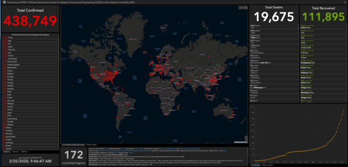
Caption: As of March 25, 2020 there are 438,749 confirmed cases, with 111,895 recovered
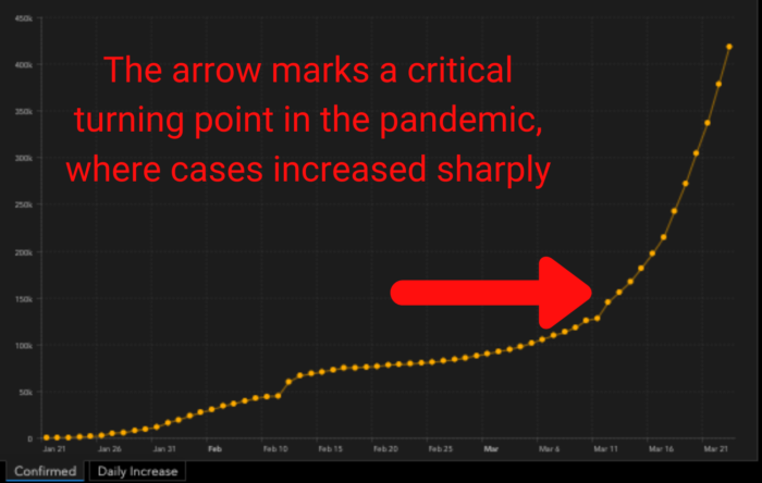
Axis X represents the date in months. Axis Y represents the amount of cases. The arrow demonstrates the steep point of increase in confirmed cases
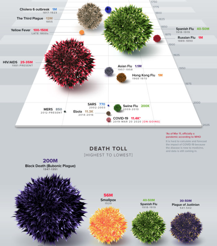
If you’re seeking a little more historical perspective on the issue, look no further than Visual Capitalist’s infographic, which presents the historical impact of different pandemic scenarios from different centuries. Ugly spiky ball images representing different pandemics are laid out on a timeline. The size of the virus as presented is indicative of their overall death toll. For instance, the in year 1347 to 1351 the Bubonic Plague had a death toll of 200M which is 112.5% more than Smallpox in 1520, 56M. They accurately illustrate the impact of different pandemics throughout history by using image sizing techniques as well as different colours and fonts to present data. By understanding the historical impact of different pandemics, this infographic encourages the world to act fast and avoid it turning into a far more serious situation.
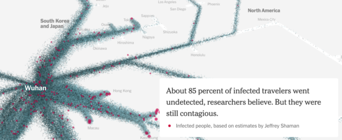
The New York Times: How the Virus Got Out
This piece from the New York Times, entitled How The Virus Got Out, is a fantastic demonstration of communication and content presentation. As the user scrolls down, interactive information is provided an animated graphical representation that illustrates how the virus originated, and ultimately how it spread throughout the globe.
Both the Visual Capitalist Infographic and New York Times attempt to illustrate historical perspective on the virus. By demonstrating urgency, it hopes to educate people on just how fast everything changed and how serious it has become.
Given the severity of the situation, it’s important that marketing teams and communication experts get both the messaging, and their business practices right surrounding COVID-19. Some campaigns are simply not appropriate. Try to avoid:
There are several ways to contribute as a business in time of crisis. For instance, if you can genuinely assist companies via either products or services, then your messaging should reflect that.
Governments all across the globe have told people to stay home, and there's good reason for that. There simply isn’t enough health-care capacity anywhere in the world if the situation greatly worsens, that is why we must all partake in this.
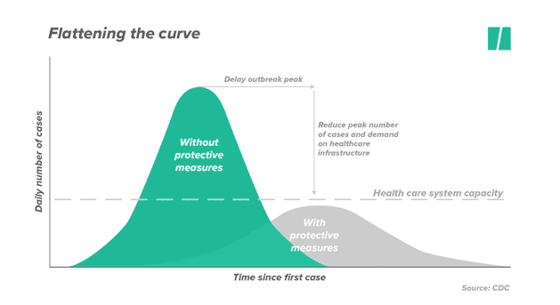
This GIF animation visualizes the concept of Flattening the Curve
Instead of a surge creating a spike in new cases to overcrowd hospitals, the number of cases will flatten overtime. It essentially means that the fewer people are exposed to risks, the lower the amount of new cases there will be. We must all ride this together over time.
Anyone looking for a comprehensive guideline, the CDC has offered a detailed breakdown on how they can protect themselves, prevent COVID-19 from spreading, as well as protect others. The recommendations are outlined with bullet points and easy to grasp graphics.

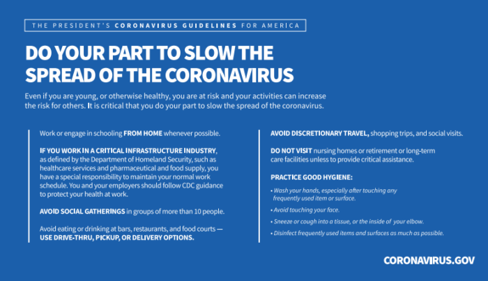
The Whitehouse put together Coronavirus.gov, a website with resources for traveling citizens, households, healthcare professionals and businesses. They also made The President's Coronavirus Guidelines for America easily accessible.
The President urges the public to take 15 Days of Action to Slow the Spread. This visual guidance piece follows many of the same content guidelines as the Ipsos whitepaper mentioned above, by presenting guidelines in a very straight forward, accessible way. The copy is also motivational in nature and tone, attempting to urge citizens to do their part in slowing the pandemic by staying home if they feel sick, and avoiding large gatherings of people.
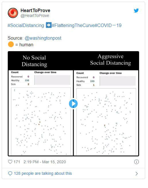
Practicing “Social Distancing” is an incredibly effective way to slow this pandemic down. According to the Government of Canada this means minimizing your contact with others by changing your every day routine. This includes avoiding crowds, keeping a distance of at least 2 arm's length, and limiting contact with at risk groups. If you have COVID-19 and you stay away, you won’t pass on the virus to others who might be at risk. This concept is explained by these burning matchsticks. This simulation of balls bouncing around explains very well the impact social distancing can have in slowing the spread of the virus

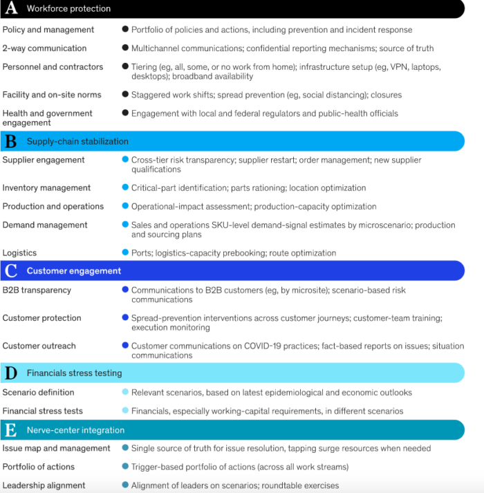
Organizations that are impacted by COVID19 must have an appropriate response plan, along with processes and policies in place that will help mitigate and ultimately overcome this challenge. Consultancies like McKinsey and Company have developed a comprehensive scenario based guideline for businesses.
The action that businesses can take is broken down into separate categories: A for Workforce protection, B for Supply-chain stabilization, C for Customer engagement, D for Financials stress testing, and E for Nerve-center integration.
To join the digital conversation, follow these hashtags:
#Flatteningthecurve
#StayHomeSaveLives
#WFH
#SocialDistancing
#Safehands
#TogetherAtHome
#Coronavirus
Stay safe, healthy and well informed! We are all in this together!
-- Macro has the infrastructure and systems to continue business as usual in these challenging times. All of our experts are able to work from home. If your marketing or sales operations need extra brains and hands, then our consultants are well equipped to support you. Use our flexible resources that can work as dedicated resources or project based.
How Subject-Matter Experts Marketed Their COVID-19 Information
Data Visualization to Express Importance
Visualize a History of Different Crises
Dos and Don’ts in Time of Crisis
World Wide Strategies & Calls-to-Actions
Social Distancing
Business Continuity Plans
Social Conversations

At Macro, we’ve been helping our clients organize webinars and virtual events for years and we thought we’d share some of the knowledge we acquired along the way to help you out.
Read More
Winston Churchill said “Never let a good crisis go to waste.” With the recent challenges brought on by the COVID-19 pandemic, many companies are changing their practices to reflect the new reality. You might be wondering, how can I use this time effectively?
Read More
Database management is often overlooked, but it shouldn’t be - because good, clean data is the secret of the successful modern marketer. Like a vehicle, it needs to be regularly maintained, fine tuned and cleaned to keep it at optimal performance.
Read MoreMacro makes it easy for companies to run marketing and sales operations at scale. We enable companies with their digital marketing technologies to make better data-driven decisions.
Macromator Inc.
417 Bloor St West, Unit 203 Toronto, Ontario M5S 1X0
Satellite offices in San Diego, São Paulo, Bucharest, Spain, and China

+1 647 760 8629
info@macromator.com
© Macromator Inc. All rights reserved. | Privacy Policy